Cut from the fatty, boneless part of a pig’s belly, pork belly is the stuff that makes chefs swoon and then tattoo themselves with images all things swine. A close cousin of bacon (the pig’s other righteous claim to fame), pork belly is the stuff that makes brunch worth waking up for. And when it comes to pork belly, it’s all about the fat. More fat = better pork belly.
“Why should I care,” you ask?
Because just like a chef looking for prime pork belly, we too like the idea of a lot of fat on the bellies of our proverbial piggy banks. We want our piggy banks full to the brim– stuffed with oodles of cash and statements from illustrious bank accounts, well-performing investments, and healthy retirement savings plans. No one ever talks about wanting a skinny piggy bank. It’s what we spend hours at the office for and why you decided against that impulse buy last weekend. But it begs the question: does a fatter piggy bank equal more happiness?
The Income/ Happiness Exercise
I decided to do something nerdy the other day. I took out a piece of graph paper and graphed my yearly income– starting from the first year out of college up until now– and then graphed how happy I was during the same timeframe right on top of that:
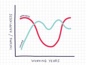
Pseudoscientific Analysis:
1. After picking up my spirits (rosé to the rescue) regarding the whole income line nosedive (cheers to the foray into self-employment!), the relationship between money and income became undeniably clear.
2. I might have been naive at 22, but I was happy despite an income that wasn’t generous. When I was rolling in the proverbial dough, I was utterly disenchanted by my job at the time; I wasn’t all that happy. With the benefit of hindsight I’m able to ask myself: “was it worth it?”
3. While I might have been a tad dramatic with the happiness line (if I wasn’t lazy enough to re-draw it I’d make it look less suicidal in that chasm and it would be a lot higher now), it’s apparent that income doesn’t necessarily correlate with happiness for me.
Researchers find that happiness tends to increase until people make about $75,000, but not much after that, no matter where they live in North America.
These studies show that happiness is often impacted by income, but only up until that $75,000 threshold– it’s kind of like the sweet spot where one’s basic needs are met, where paying the basic bills isn’t a significantly difficult or stressful endeavor each month. Beyond that point, additional income isn’t proven to make people happier. A raise or a bonus does feel good, but research shows that for most people the happiness isn’t sustainable.
You can debate the merits of the point above, and of course it depends what you value (some hold financial security more important than doing meaningful work, for example, and it’s nothing to be judged for– just like how you might choose the veggie frittata at breakfast while someone might order the pork belly with bacon on the side).
I’m thinking you need to do the whole graph thing before you do anything else today (including flossing), so you need a handy step-by-step guide to the most insightful task you could possibly do all month, right?
The step-by-step guide to completing your chart
STEP #1: Take out a piece of graph paper (and if you’re not a nerd like some of us around here, a plain piece of paper or the side of an Amazon delivery box will work just fine).
STEP #2: Draw a graph with the years you’ve worked across the bottom (x axis) and the income increments you’ve earned across the side (y axis). Plot your income year to year, and make a line connecting each dot. (Science people call that a line graph.)
STEP #3: Plot how happy you were each year, with the top of the chart representing you at the peak of giddy happiness and the bottom of the chart representing you at the swirling depths of unhappiness. (Please don’t be a smartass and draw below the line.) It’s an imperfect science, remembering your happiness from years back– but you can do it, champ.
STEP #4: Sit back and analyze. Ask a friend or family member or colleague for input. (My husband, whom I love and thought knew me a little bit after almost 20 years, gaffed when I showed him my graph and said he didn’t know me at all. I’m going to go and reintroduce myself after I’m done with this article.)
What does your graph look like? Do your lines relate or criss-cross or swirl? And what do those lines say about you, if anything? Reach out to me if you have any comments or questions.
(And if all that talk about pork belly got you hot and bothered, contact me for a great recipe. I’m not just interested in helping you live life to the fullest. I’m into fatty meats, too.)